The New Logo
Note: This article was originally written for the October 2019 Edition of the Beachside Press.
By Will San Jose '22
Greens Farms Academy has introduced a new logo for the 2019-2020 school year. An independent committee partnered with the school and the Director of Marketing, Ms. Levi, to update the logo as GFA approaches its centennial.
The rebranding process began in January of 2017 before Mr. Whelan was hired as the Head of School. Initially, the school intended to only create official wordmarks, but the firm suggested revisiting the crest and adding a logo for athletics.
Mr. Whelan said a reason for the change was the need for GFA’s logo to represent the modernity of the school. “There are parts of our experience that are very traditional, but also a really significant part of our experience would be characterized as being more approachable, and warm, and engaging,” he said. “Ultimately it’s about telling a school’s story.”
Ms. Levi said she believes the new logo will help raise awareness for GFA’s story. “The only thing that we really added was the ‘1925,’ because we should be very proud of our longevity as an institution,” she said.
“[GFA is] the stories that are told by students and our families out there,” Mr. Whelan added. “What people are drawn to is the sense of community when they get here, and we wanted to have a visual identity that felt even more approachable.”
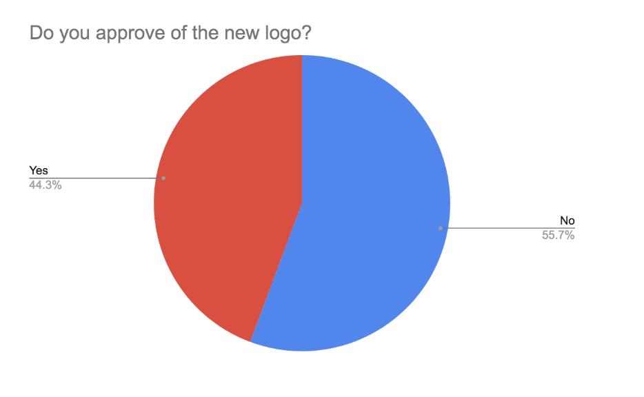
Greens Farms Academy students are split on whether or not they approve of the new logo. In an October poll sent to all Upper School students, 44% of responses—39 of 89 total—said they approved of the crest.
“It’s simple and clean and was clearly well thought out,” one positive response stated.
“It makes [the logo] look more modern and advanced, like the school,” another student who approved said.
Negative responses cited the lack of color and the modern look to be the reasons for their disapproval.
“I think that the monochromatic theme of the new logo takes away from the bright and vibrant culture and history that GFA has, and I feel like the dark color tone of the new logo makes the logo seem more boring and dreary,” a negative response stated.
Another said the new logo took out too much of the traditional aspect. “The old one symbolizes our school's tradition and legacy, but this one just doesn't show that at all,” the student said. “I understand they are trying to show ‘modernity with tradition,’ but they could have designed it to be symmetrical, meaningful, and not a hodgepodge of things that don't go together.”
The school aimed to perfect the new crest during the rebranding process, going through 20 drafts of the logo before landing on the final version. “It’s our hope that the new crest and wordmark will allow us to more effectively support our collective efforts to tell the vibrant, evolving GFA story,” Mr. Whelan said.

